Matplotlib for Plotting
In python plotting is not that straight forward as compared to R or Matlab. But given a fair share of time it can be easily understood. Python’s plotting library Matplotlib makes things pretty easy to use. Most of the issues people face while using Matplotlib are related to library import and which module to use since python does not have in-build plotting functions like R/Matlab. Hence importing modules make it sound a bit cumbersome than other counterparts.
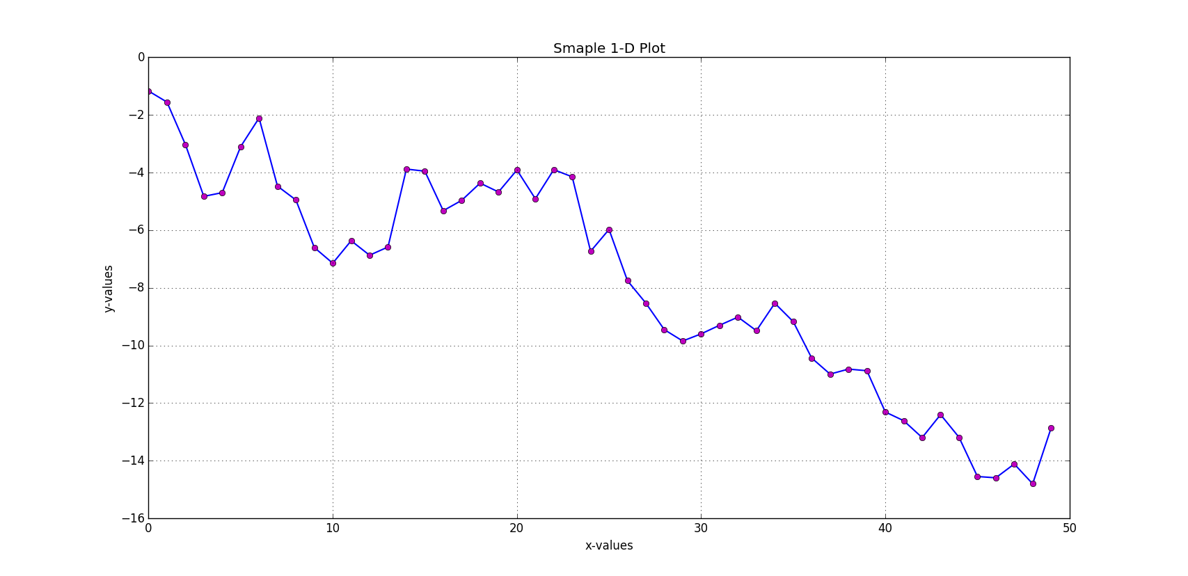
One Dimensional Plotting
import numpy as np
import matplotlib.pyplot as plt
import pylab

np.random.seed(1010)
# generate 50 random numbers from standard normal distribution
y = np.random.standard_normal(50)
x = range(len(y))
# a blue line with width 1.5 points
plt.plot(y.cumsum(), 'b', lw = 1.5)
# m -> magenta color and o -> circle marker
plt.plot(y.cumsum(), 'mo')
# allow grids to show in the plot
plt.grid(True)
# put your x axis label
plt.xlabel('x-values')
# put your y axis label
plt.ylabel('y-values')
# put your plot title
plt.title('Smaple 1-D Plot')
# otherwise your plot wouldn't show after script is run
pylab.show()
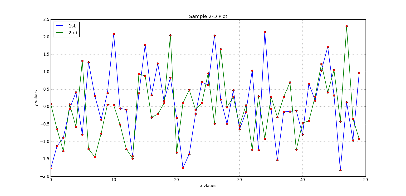
Two Dimensional Plotting
import numpy as np
import matplotlib as mpl
import matplotlib.pyplot as plt
import pylab

np.random.seed(2020)

y = np.random.standard_normal((50,2))
# generate a 2-D matrix full of random numbers
plt.figure(figsize=(7,4))
# length of width of plot
plt.plot(y[:,0], lw=1.5, label='1st')
# plot first column of matrix
plt.plot(y[:,1], lw=1.5, label='2nd')
# plot second column of matrix
plt.plot(y, 'ro')
# data points with red colored circumference
plt.grid(True)
# show grid lines
plt.legend(loc=0)
# legend at their best possible position
plt.xlabel('x-vlaues')
# provide x-label
plt.ylabel('y-values')
# provide y-label
plt.title('Sample 2-D Plot')
# provide plot title
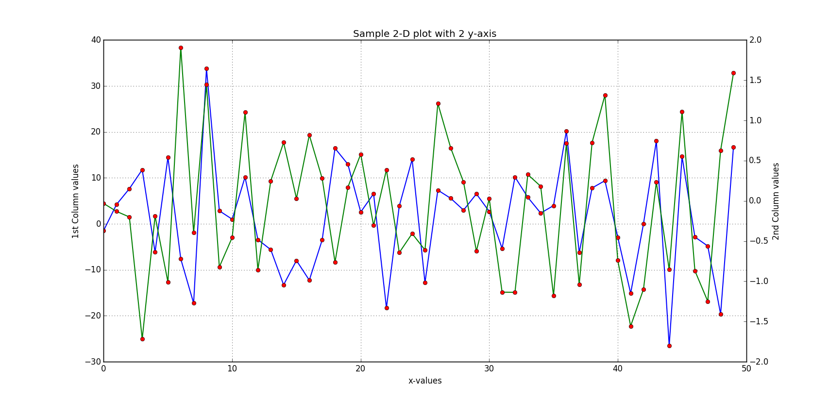
2-D plot with 2 y-axis of different scale
np.random.seed(3030)
y = np.random.standard_normal((50,2))
y[:,0] = y[:,0]*10
fig, ax1 = plt.subplots()
# plot first column using left axis
plt.plot(y[:,0], 'b', lw=1.5, label='1st')
plt.plot(y[:,0], 'ro')
plt.grid(True)
plt.xlabel('x-values')
plt.ylabel('1st Column values')
plt.title('Sample 2-D plot with 2 y-axis')
ax2 = ax1.twinx()
# plot second column using right axis
plt.plot(y[:,1], 'g', lw=1.5, label='2nd')
plt.plot(y[:,1], 'ro')
#plt.legend(loc=8)
plt.ylabel('2nd Column values')
# provide plot title
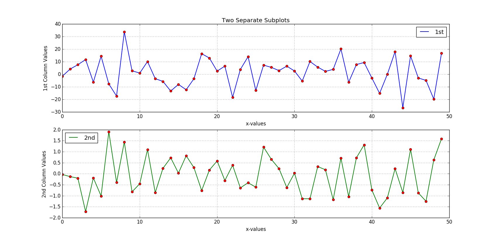
2 Separate Subplots
np.random.seed(3030)
y = np.random.standard_normal((50,2)) #.cumsum(axis=0)
y[:,0] = y[:,0]*10

plt.figure(figsize=(7,5))
# row-wise plotting
plt.subplot(2, 1, 1) # numrows, numcols, fignum
plt.plot(y[:, 0], lw=1.5, label='1st')
plt.plot(y[:, 0], 'ro')
plt.grid(True)
plt.legend(loc = 0)
plt.xlabel('x-values')
plt.ylabel('1st Column Values')
plt.title('Two Separate Subplots')
plt.subplot(2, 1, 2)
plt.plot(y[:,1], 'g', lw=1.5, label='2nd')
plt.plot(y[:,1], 'ro')
plt.grid(True)
plt.legend(loc=0)
plt.xlabel('x-values')
plt.ylabel('2nd Column Values')
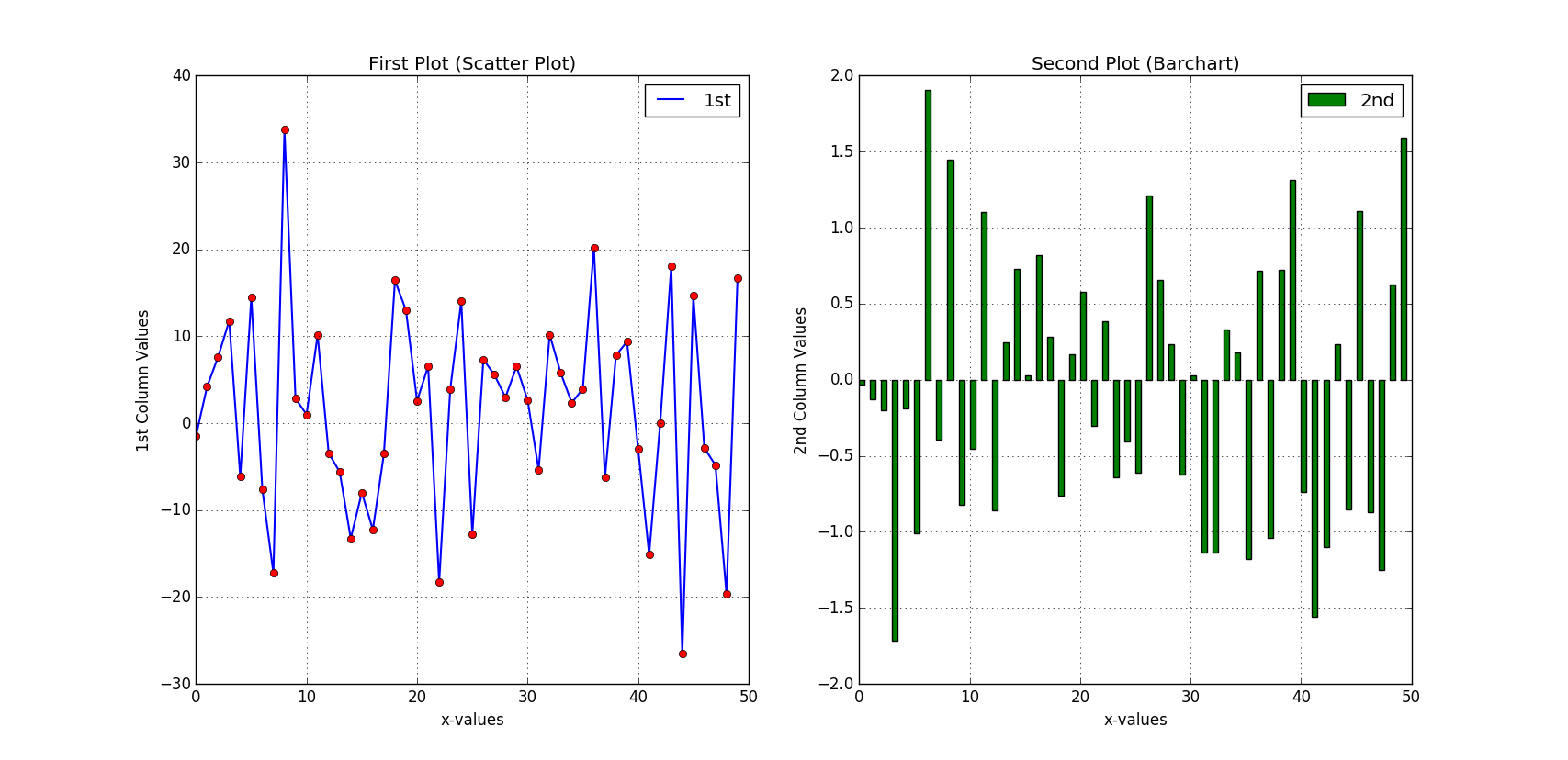
Subplots of Different Type
np.random.seed(3030)
y = np.random.standard_normal((50,2)) #.cumsum(axis=0)
y[:,0] = y[:,0]*10
plt.figure(figsize=(9,4))
# column arrangement
plt.subplot(1,2,1)
plt.plot(y[:,0], lw=1.5, label='1st')
plt.plot(y[:,0], 'ro')
plt.grid(True)
plt.legend(loc=0)
plt.xlabel('x-values')
plt.ylabel('1st Column Values')
plt.title('First Plot (Scatter Plot)')

plt.subplot(1,2,2)
plt.bar(np.arange(len(y)), y[:,1], width=0.5, color='g', label='2nd')
plt.grid(True)
plt.legend(loc=0)
plt.xlabel('x-values')
plt.ylabel('2nd Column Values')
plt.title('Second Plot (Barchart)')